Forest Plot With Heterogeneity Bands
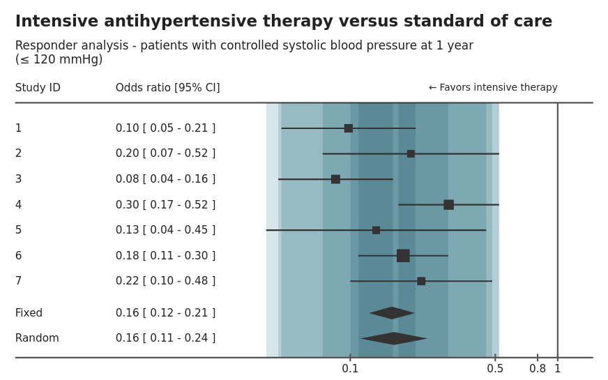
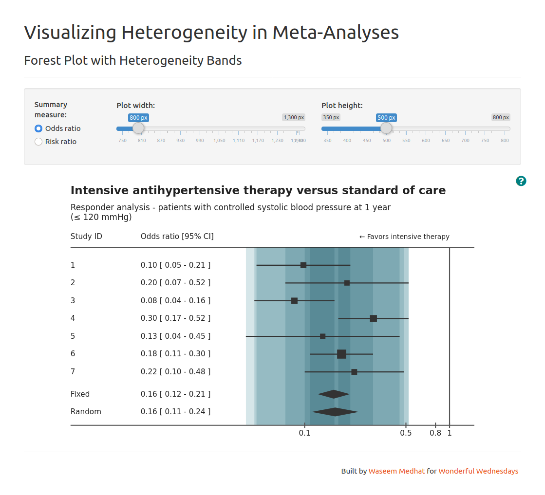
This visualization project is a custom version of a forest plot with additional bands that better visualize heterogeneity between studies in a meta-analysis. The plot is built with JavaScript using the D3.js library and wrapped in a Shiny app.
Note: This project was submitted to the Wonderful Wednesdays challenge hosted by PSI and reviewed by statisticians in the organization. Find more here.
Plot description

A lot of the plot components are directly comparable to the typical forest plot, which is very popular in the medical field as a tool to visualize an effect size in multiple studies for the purpose of combining those effect sizes into a pooled estimate (meta-analysis).
The main features are:
- A square for each point estimate for a study. The square size is proportional to the sample size (i.e. weight) of that study.
- A line for each confidence interval of the effect size in a study.
- Diamonds that represent the pooled estimate using either fixed-effect or random-effects model. The diamond width represents the confidence interval around the pooled estimate.
- The plot is usually combined with the numbers.
My own additions are:
- Colored bands to give a better visualization of the heterogeneity between studies. There is a band for each study, and all are semi-transparent and overlayed over each other so that more overlapping produces darker areas.
- More attention to annotations than the typical plots, providing a title and a subtitle with the interventions and the outcome, respectively. Another label is also added to show which direction represents the “positive” effect.
App description

As a proof of concept for a viable product, I wrapped the plot in a Shiny app which provides additional interactive features.
- Selection of summary measure.
- Control over the plot dimensions.
- Help button that shows a guide for interpretation.
Links
- Live version of the Shiny app: https://waseem-medhat.shinyapps.io/forest_plot_with_bands/
- GitHub: https://github.com/waseem-medhat/forest_plot_with_bands
- Wonderful Wednesdays December submissions: https://vis-sig.github.io/blog/posts/2020-12-03-wonderful-wednesdays-december-2020/
