Two Weeks of Data Visualization
In this post I document my first two weeks diving back into data visualization while working with the web-based tools D3.js and React, from silly SVG faces to interactive scatter plots.
Learning material and technologies
First of all, I would like to say that most of that work was done through learning from the open course Datavis 2020 by Curran Kelleher.
Also, the technologies used in these visualizations are tightly close together. It hard to say “I used D3 for this” when there’s HTML, CSS, non-D3 JavaScript, and SVG underneath.
Visualizations
Here are a bunch of pieces that represent milestones in this my two-week journey.
Silly SVG face

That is probably the silliest thing you could do while learning “data visualization”, except that its purpose was learning how to work with SVG. D3 (or probably all web-based data vis) is supposed to render SVG shapes. So, before working with actual data, it was a good idea to practice building shapes with SVG and making sure it is drawn with variables and a little math to make it pixel-perfect.
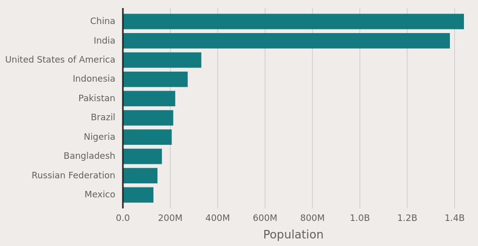
Basic plots

While this visually seems like a direct next step, much has been going on between that SVG face and this. There is a combination of React, D3, and vanilla JavaScript that I had to learn in order to build a bare bones bar chart or scatter plot.
- D3 has wide functionality like helper functions for data fetching, data manipulation, and scales to map data ranges to pixel ranges.
- React is used to render and organize every visible element using the data and D3 scales.
- Vanilla JavaScript glues all that code together with logic for conditionals, iteration, etc.
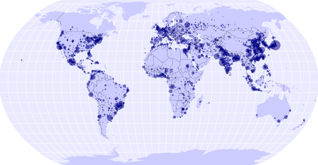
World map with points

This one was more heavy on D3 code, as D3 contains a lot of helper functions to draw parts of the map and set projections which affect the shape of the map. I actually want to read and practice more with geo-spatial data and their visualization.
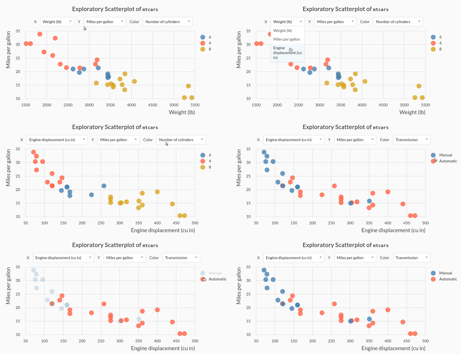
Interactive scatter plot

This was the most complicated piece of work that I did in these two weeks. Beside the same stuff used in the simpler plots, the project also includes a third-party module for the drop-down menus. I also used some combined React+CSS logic to make that animated fade effect with the legend.
Future plans
I will, of course, continue with the lessons of Datavis 2020 as it gets updated. But there is this cool idea I have been thinking of for a while, which is to build a slide deck with this tech stack. I know there are different JavaScript libraries that make web-based presentations. All I need is to explore them and make data presentations.
Hope you enjoyed this colorful post… There is definitely more to come!
